

Designing for Safety at Every Scale
Reimagining Uber’s safety experience through inch-to-yard interactions
Role
Interaction Design
Design Systems
Product Strategy
Design Critique
For solo riders traveling alone at night or through unfamiliar areas, feeling safe shouldn't require feeling stressed.
Yet current safety measures place the burden of vigilance entirely on the rider, leaving many to rely on improvised workarounds — like staying on the phone with a friend — just to feel secure enough to reach their destination.
Year
2025
Designing for Safety at Every Scale
Reimagining Uber’s safety experience through inch-to-yard interactions
Role
Interaction Design
Design Systems
Product Strategy
Design Critique
Year
2025
For solo riders traveling alone at night or through unfamiliar areas, feeling safe shouldn't require feeling stressed.
Yet current safety measures place the burden of vigilance entirely on the rider, leaving many to rely on improvised workarounds — like staying on the phone with a friend — just to feel secure enough to reach their destination.
Why does this matter?
Ride-sharing app safety features assume riders are fully attentive, calm, and actively monitoring their phones.
In reality, moments when safety matters most are when attention is limited. Constantly checking a screen, tracking routes, or deciding when to escalate a concern can increase cognitive load rather than reduce it.
This problem disproportionately affects young solo riders who rely on informal workarounds like calling a trusted person, memorizing routes, or avoiding certain areas altogether—to feel safe.
The challenge is not adding more safety features, but designing safety systems that support riders quietly, contextually, and across devices—without demanding constant vigilance.
Why does this matter?
Ride-sharing app safety features assume riders are fully attentive, calm, and actively monitoring their phones.
In reality, moments when safety matters most are when attention is limited. Constantly checking a screen, tracking routes, or deciding when to escalate a concern can increase cognitive load rather than reduce it.
This problem disproportionately affects young solo riders who rely on informal workarounds like calling a trusted person, memorizing routes, or avoiding certain areas altogether—to feel safe.
The challenge is not adding more safety features, but designing safety systems that support riders quietly, contextually, and across devices—without demanding constant vigilance.
Meet Connie
When uncertainty creeps in, Connie creates her own safety net. She'll start a phone call with her emergency contact, inform trusted contacts of her ETA, or stay hyper-vigilant of her surroundings.
The Ride Share App’s built-in safety features exist, but she rarely engages with them unless something feels actively wrong—they feel reactive rather than supportive.
Independent, cautious, and constantly managing attention while on the move

Connie needs safety tools that work quietly in the background, offering reassurance without demanding attention or creating alarm
Meet Connie
Independent, cautious, and constantly managing attention while on the move
When uncertainty creeps in, Connie creates her own safety net. She'll start a phone call with her emergency contact, inform trusted contacts of her ETA, or stay hyper-vigilant of her surroundings.
The Ride Share App’s built-in safety features exist, but she rarely engages with them unless something feels actively wrong—they feel reactive rather than supportive.
Connie needs safety tools that work quietly in the background, offering reassurance without demanding attention or creating alarm



Connie needs a way to get home safely in an Uber at night
Inch
Sticking to a pre-selected route
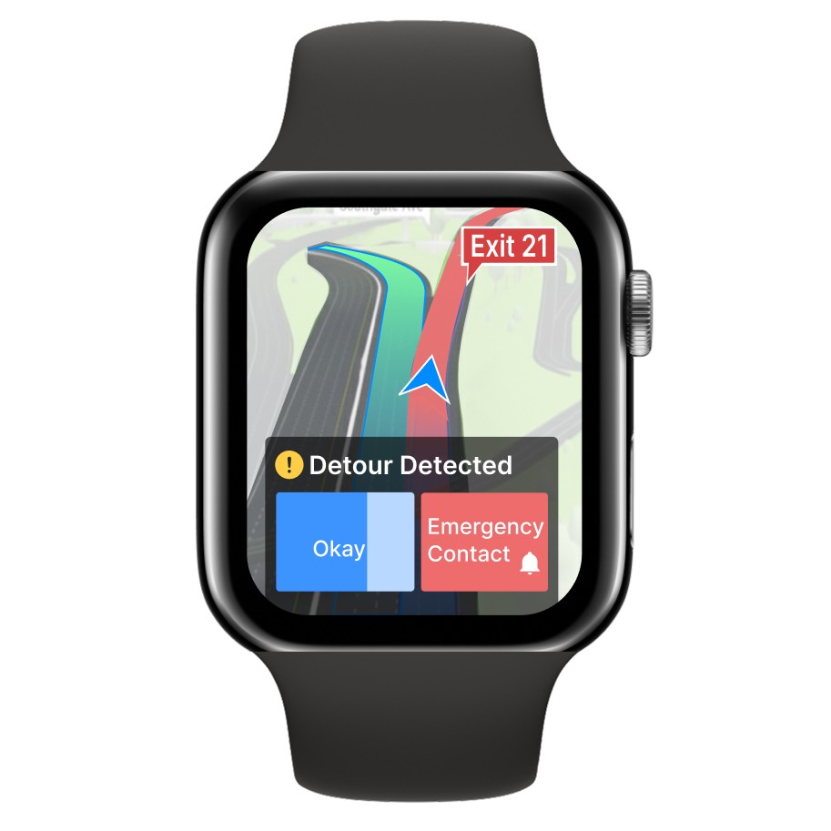
However, because her phone is by her ear during the call, she needs a way to monitor her ride using her Apple Watch. She doesn’t need constant updates just a heads up if there’s a detour.
Since Connie isn’t familiar with the area, she wants to make sure the driver is following the correct freeway exits and not deviating from a pre-selected route.
When there is a detour the apple watch vibrates
10 seconds to press “okay” or her emergency contact gets an alert message/call.
As a safety measure, Connie keeps a trusted contact on the phone during the Uber ride. This also subtly signals to the driver that someone is tracking her ride.
How does she ensure this?
Keeping someone informed
When there is a detour the apple watch vibrates
10 seconds to press “okay” or her emergency contact gets an alert message/call.
Connie needs a way to get home safely in an Uber at night
How does she ensure this?
Inch
Sticking to a pre-selected route
Since Connie isn’t familiar with the area, she wants to make sure the driver is following the correct freeway exits and not deviating from a pre-selected route.
However, because her phone is by her ear during the call, she needs a way to monitor her ride using her Apple Watch. She doesn’t need constant updates just a heads up if there’s a detour.
Keeping someone informed
As a safety measure, Connie keeps a trusted contact on the phone during the Uber ride. This also subtly signals to the driver that someone is tracking her ride.


Prototyping
During critique, Professor Scott Klemmer asked whether the inch-scale interaction could be reduced to a simple red/green indicator.
To which I replied: Well no, the user needs more information than that to…
Prof. Klemmer: Awesome! Now what exactly does the user need to know and what happens if they don't have access to that information?
That question reframed my thinking. Instead of simplifying from the top down, I began asking:
At the inch scale, simplification isn’t about removing features — it’s about validating the purpose of every pixel.
Critique that shifted my approach
Design Learning
A top-down mindset risks enforcing designer assumptions about what users “should” understand, while a bottom-up approach evaluates how each visual cue supports real judgment and trust.
Micro-interactions for passive reassurance during low attention.
Design Lens
What is the minimum information my user needs to make a decision?


Prototyping
Micro-interactions for passive reassurance during low attention.
Design Lens
Critique that shifted my approach
During critique, Professor Scott Klemmer asked whether the inch-scale interaction could be reduced to a simple red/green indicator.
To which I replied: Well no, the user needs more information than that to…
Prof. Klemmer: Awesome! Now what exactly does the user need to know and what happens if they don't have access to that information?
That question reframed my thinking. Instead of simplifying from the top down, I began asking:
What is the minimum information my user needs to make a decision?
At the inch scale, simplification isn’t about removing features — it’s about validating the purpose of every pixel.
Design Learning
A top-down mindset risks enforcing designer assumptions about what users “should” understand, while a bottom-up approach evaluates how each visual cue supports real judgment and trust.
Foot
Connie’s trusted contact needs a way to ensure that Connie travels through safe parts of town when she is exploring a new city
How can I quickly recommend a safe route to Connie?
Which routes are safe?
Where is Connie’s Uber?
What does safety mean?


Foot
Which routes are safe?
Where is Connie’s Uber?
What does safety mean?
Connie’s trusted contact needs a way to ensure that Connie travels through safe parts of town when she is exploring a new city
How can I quickly recommend a safe route to Connie?
Prototyping
Reframing route selection as a collaborative decision, rather than an isolated, time-pressured choice.
Design Lens
What factors signify safety?
Are the shops still open in the area?
Police Checks
Crowd? More people = safer
Street lights
Other people's review of safety in the area

Critique that shifted my approach
I wish I could understand this map better with respect to where Connie is right now
Is this ETA from Connie's current location or where she started from?
Where is Tenderloins on the map?
Seeing the Preview of each route as a separate visual is confusing
Changes in Information Architecture
"Unlike static and rigid interfaces, generative and malleable ones offer the potential to respond to diverse users' goals and tasks."
A few iterations later………
The user wants to achieve something, and knowing helps them do that. So it’s important to ask: what is that something?
Knowing or understanding is never a real user goal
Design Learning
Safety means different things to different people, and users should be able to find the best route according to the factors that matter most to them. The interface should adapt generatively to reflect those priorities.
Inspired by Prof. Xia's Malleable interfaces paper


Prototyping
Reframing route selection as a collaborative decision, rather than an isolated, time-pressured choice.
Design Lens
What factors signify safety?
Are the shops still open in the area?
Police Checks
Crowd? More people = safer
Street lights
Other people's review of safety in the area
Critique that shifted my approach
I wish I could understand this map better with respect to where Connie is right now
Is this ETA from Connie's current location or where she started from?
Seeing the Preview of each route as a separate visual is confusing
Where is Tenderloins on the map?
Changes in Information Architecture
Inspired by Prof. Xia's Malleable interfaces paper
"Unlike static and rigid interfaces, generative and malleable ones offer the potential to respond to diverse users' goals and tasks."
Safety means different things to different people, and users should be able to find the best route according to the factors that matter most to them. The interface should adapt generatively to reflect those priorities.
A few iterations later………
Design Learning
The user wants to achieve something, and knowing helps them do that. So it’s important to ask: what is that something?
Knowing or understanding is never a real user goal

Blue Screen Foot Scale
Yard
Group Coordination in Shared Public Spaces
After landing at a super busy airport, Connie uses an Uber kiosk designed for public ride share.
Connie needs a way to find her Uber while navigating through the airport crowd.
The large public-facing screen clearly directs passengers to the correct pickup lane without revealing sensitive details.
If Connie is sharing a ride how do we respect her privacy?
How does the crowd affect finding an Uber?

Since users wouldn't want their personal details like their address visible to people behind them in the queue
This separation between the Foot and Yard scale screens enables smooth group coordination in crowded spaces while preserving individual privacy and agency.
Pink Screen Yard Scale
Shared context and group decision-making in public environments.
Design Lens
Critique that shifted my approach
The “I wish” method is a fantastic way to communicate improvements that can be made to a design. It shows that you're on the same team as the person whose work you're critiquing, rather than just pointing out flaws.
Design Learning
On a yard scale design information should be prominent even without interaction
Yard
Group Coordination in Shared Public Spaces
After landing at a super busy airport, Connie uses an Uber kiosk designed for public ride share.
Connie needs a way to find her Uber while navigating through the airport crowd.
If Connie is sharing a ride how do we respect her privacy?
How does the crowd affect finding an Uber?
This separation between the Foot and Yard scale screens enables smooth group coordination in crowded spaces while preserving individual privacy and agency.
Design Lens
Shared context and group decision-making in public environments.
Critique that shifted my approach
On a yard scale design information should be prominent even without interaction
The “I wish” method is a fantastic way to communicate improvements that can be made to a design. It shows that you're on the same team as the person whose work you're critiquing, rather than just pointing out flaws.
Design Learning
Blue Screen Foot Scale
Since users wouldn't want their personal details like their address visible to people behind them in the queue
Pink Screen Yard Scale
The large public-facing screen clearly directs passengers to the correct pickup lane without revealing sensitive details.
A special thanks to Professor Scott Klemmer for crafting such an interactive studio course that has taught me about user-centric design and effective communication in more ways than I can count :)
A special thanks to Professor Scott Klemmer for crafting such an interactive studio course that has taught me about user-centric design and effective communication in more ways than I can count :)