VISUALIZING FOR
TRUST AND TRICKERY

VISUALIZING FOR
TRUST AND TRICKERY
How design choices shape belief, persuasion, and misinterpretation in data storytelling.
How design choices shape belief, persuasion, and misinterpretation in data storytelling.
LATEST
STORIES
LATEST
STORIES

In collaboration with Timothy Zhang

Trust
Trust
CLICK
NAT GEO MAGAZINE
X SOCIAL MEDIA
Trickery
Trickery
CLICK

Data-driven visualizations built on tableau
BACK STORY
BACK STORY
This project started with a simple, uncomfortable question: if the exact same dataset, with nothing fabricated or changed, can be shaped into two completely opposite conclusions, how do we know which one to believe? And what is it about a chart that makes it feel trustworthy in the first place?
For a course on Information Visualization, my partner and I took one dataset, OECD greenhouse gas emissions, and told two stories with it. The first, a story built for trust: a clean, editorial look at how the US and other nations are tracking against their Kigali Amendment and AIM Act commitments to phase down hydrofluorocarbons. The second, a story built for trickery: the same underlying data, re-encoded with truncated axes, cherry-picked framing, and quietly weaponized color, engineered to convince a skeptical audience that HFC regulation isn't worth caring about.
Nothing in the deceptive version is fabricated. That's what made building it so eye-opening, realizing just how easily we all fall prey to these forms of visualization deception, and exactly the point.
This project started with a simple, uncomfortable question: if the exact same dataset, with nothing fabricated or changed, can be shaped into two completely opposite conclusions, how do we know which one to believe? And what is it about a chart that makes it feel trustworthy in the first place?
For a course on Information Visualization, my partner and I took one dataset, OECD greenhouse gas emissions, and told two stories with it. The first, a story built for trust: a clean, editorial look at how the US and other nations are tracking against their Kigali Amendment and AIM Act commitments to phase down hydrofluorocarbons. The second, a story built for trickery: the same underlying data, re-encoded with truncated axes, cherry-picked framing, and quietly weaponized color, engineered to convince a skeptical audience that HFC regulation isn’t worth caring about.
Nothing in the deceptive version is fabricated. That’s what made building it so eye-opening, realizing just how easily we all fall prey to these forms of visualization deception, and exactly the point.

DATA STORY
DATA STORY
The Kigali Amendment and the U.S. AIM Act represent two major efforts to reduce the use of hydrofluorocarbons (HFCs), a class of gases with extremely high global-warming potential. Together, they set the foundation for a coordinated, long-term reduction in HFC production and consumption.
The Kigali Amendment and the U.S. AIM Act represent two major efforts to reduce the use of hydrofluorocarbons (HFCs), a class of gases with extremely high global-warming potential. Together, they set the foundation for a coordinated, long-term reduction in HFC production and consumption.
SITUATIONAL CONTEXT
SITUATIONAL CONTEXT
As countries enter the first major evaluation periods for the AIM Act and the Kigali Amendment, understanding who is meeting their reduction commitments—and who is falling behind helps reveal how effectively the world is responding to the climate impacts of HFCs.
As countries enter the first major evaluation periods for the AIM Act and the Kigali Amendment, understanding who is meeting their reduction commitments—and who is falling behind helps reveal how effectively the world is responding to the climate impacts of HFCs.
AUDIENCE
AUDIENCE
People who seek clear, trustworthy explanations of climate policy and environmental trends but may not have technical expertise. They are the general reading public of a reputable science and nature magazine like the National Geographic.

Global Progress Under the Kigali Amendment
INTERNATIONAL
Global Progress Under the Kigali Amendment
INTERNATIONAL
The Kigali Amendment aims to reduce global HFC emissions by 85% by 2036. We want to track the progress of the top 5 contributors to HFC emissions in the “Group 1:Non‑Article 5 developed countries” category of the Kigali Agreement over the first phase of the agreement.
The Kigali Amendment aims to reduce global HFC emissions by 85% by 2036. We want to track the progress of the top 5 contributors to HFC emissions in the “Group 1:Non‑Article 5 developed countries” category of the Kigali Agreement over the first phase of the agreement.

Clearly labelled legend and axes in the same orientation as written content
Semantically consistent graphical markers for the data, eg. Baseline is a line marker
Hue marker to signify that the Present values and Kigali value bars represent similar data
Clearly labelled legend and axes in the same orientation as written content
Hue marker to signify that the Present values and Kigali value bars represent similar data
Semantically consistent graphical markers for the data, eg. Baseline is a line marker
U.S. Progress Under the AIM Act
DOMESTIC
Since the AIM Act took effect in 2020, EPA data show that the United States has steadily reduced regulated HFC production and consumption. We want to track the U.S.’ current progress towards this treaty.
Since the AIM Act took effect in 2020, EPA data show that the United States has steadily reduced regulated HFC production and consumption. We want to track the U.S.’ current progress towards this treaty.
Reference lines with labels to scaffold understanding
Accurate axes with a true 0 value
caption explaining visualization
with sources for data

Accurate axes with a true 0 value
Reference lines with annotations/labels
to scaffold understanding
caption explaining visualization
with sources for data


Data Story
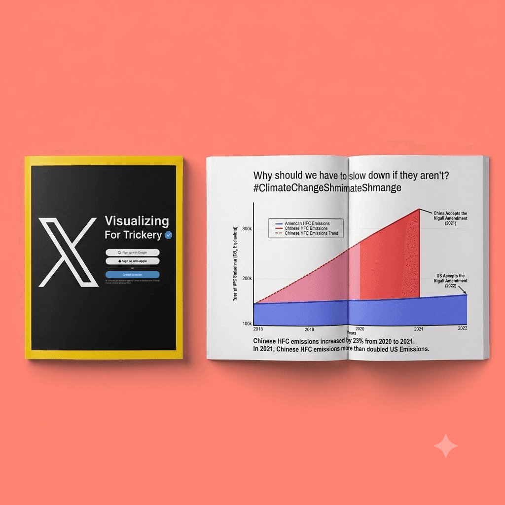
The United States and China are the top two largest contributors of Hydrofluorocarbon emissions, however China is producing much more pollution than the US. How much Hydrofluorocarbon emissions does the US produce in comparison to China? Should the US bear as much responsibility for reducing HFC emissions
Audience and Situational Context
The US is a late adopter of the Kigali agreement. However, China, the largest contributor of HFC emissions, has already adopted the agreement. You are the constituency of an anti climate change legislator who believes that the US should not have to take responsibility for reducing emissions viewing the visualization from an X post

Emphasizing US vs China in title,
annotations, and color encodings
primes audience to feel adversarial
X-axis starts at 100k making the
US line seem lower than it is
Encoding magnitude as area makes the magnitude feel larger relative to heigh of points on a line
Limited axes ranges flattens curves. US upward trend much less apparent
Cherrypicked information in the caption
Data Story
The United States and China are the top two largest contributors of Hydrofluorocarbon emissions, however China is producing much more pollution than the US. How much Hydrofluorocarbon emissions does the US produce in comparison to China? Should the US bear as much responsibility for reducing HFC emissions
Audience and Situational Context
The US is a late adopter of the Kigali agreement. However, China, the largest contributor of HFC emissions, has already adopted the agreement. You are the constituency of an anti climate change legislator who believes that the US should not have to take responsibility for reducing emissions viewing the visualization from an X post
Emphasizing US vs China in title,
annotations, and color encodings
primes audience to feel adversarial
X-axis starts at 100k making the
US line seem lower than it is
Encoding magnitude as area makes the magnitude feel larger relative to heigh of points on a line
Limited axes ranges flattens curves. US upward trend much less apparent
Cherrypicked information in the caption
A special thanks to Professor Amy Rae Fox for a course that taught us to see semiotics and information visualization in everything :)
A special thanks to Professor Amy Rae Fox for a course that taught us to see semiotics and information visualization in everything :)